


 <----->
 <--->
<--->
 This is a picture of my wife being overwhelmed by the concrete, industrial building that is Costco. This upward angle show the store's factory-like ceiling as well as Jade's expression of discomfort. Costco was so crazy this weekend and it was a bit much for us small town folk.
 I took a number of photos of my nephew Imani for a Nickelodeon audition he had Sunday night. I chose a bare wall, which I later darkened in PhotoShop. I altered a few, but I believe I used the clone stamp tool on this one to clear up his teenage skin slightly, taking away some blemishes. In this shot, my subject is looking directly at the camera.
 Next, this is one of my twin nephews holding his hands in front of the camera. For some reason, one which only a 3-year old can understand, he wanted to take several pictures with his hands like this. This picture was originally taken in color, but I changed it to black & white in PhotoShop due to the washout out hands in the foreground; adjusting the brightness and highlights wasn't working well for me. I next used the burn tool slightly on his hands. Also every adjustment I made brought out too much detail, making his wands look like an old man or just plain cartoony.
 These last two I just liked and decided to throw into the mix. I lightened each of these slightly to pull out some more detail from my subjects.
 &
& 
 &
& 
 &
& 
 &
& 
 &
&  &
&

 week and discovered I overuse them. Every time I tried to adjust a photo, the result would come out much worse than its original. Frustration would take over and I'd move on to a different picture. Finally I showed my wife some of my trials and she suggested I use it to accent existing shadows and highlights rather than use it to control brightness and darkness, which was my problem. I played around with this concept and adjusted this flower photo. The adjusted one on the left gives the appearance of sun coming through the tree branches whereas the original appears dark and drab.
 The first one here is my little friend, the red eft, still hiding under his mushroom. After a few trials, came across the graphic pen tool on page 320 of our book and thought it would make the picture look like a block from a comic, but this didn't really happen. However, I really like how it makes the picture look as though it had been sketched. I can't recall the settings I chose on this one, but I think I decreased the size of the stokes and darkened the brightness some.
 This second picture was taken about a week ago; it was taken looking up through a spiral of birch bark on the truck of a birch tree. There were a number of pictures I thought would look good with the glowing edges filter, but somehow this one stuck out the most for me. In fact, I stared at it for so long I began to see the name Obama in it. Can anyone else see that? On this one I changed the edge width to 6 and softness to 2.
 Last, I really wanted to include my kitty and began searching for a filter that preserved her beauty and made her look as though she were painted. Again, using the book I found the angled strokes filter on page 319. I really like how this filter softened her fur (I never thought Sasha's fur could ever look softer than it already does). I made the direction balance about even, then increased my stroke length and sharpness.
 then
then 
 then
then 
 then
then 
 then
then 

 In this first one, I simply used the magnetic lasso tool in order to select the red eft from one picture so I could drag it over to a second picture. I then used the Rectangular Marquee tool in order to erase part of the eft's torso so it appeared to be coming from behind the left hand wall. I tried to work its tail in, but in the end I just hid the layer. Lastly, I used the clone stamp tool to round out its face.
 In this second picture I wanted to play around with filling in the center of a sunflower. First I used the Elliptical Marquee tool to clear of the flower's center. Next, I once again used the magnetic lasso to trace the flower's outline. Then I dragged the petal outline over to the arrow hole of Doune Castle in Scotland. However, this one move left the castle wall filling in the borders of the picture, so I used the clone stamp tool to expand the the countryside and white sky to the photo's outer corners. It still looked pretty bland, so next I copied the sunset from my Oregon beach picture and the clouds from over Franconia Ridge in NH. It's not the greatest, but two countries and three states are represented.
 This final idea came at the last minute and I was too impressed with the result not to include it in this week's post. I came across this picture I have of a statue near Buckingham Palace in London. In the original, the form is so dark that it's essentially a silhouette, so I used the magic wand tool to select the negative (black) space and deleted it's contents. Next I moved in the image of the hazy trees and placed it behind the first layer. Very simple creation, but I feel it's very effective.
For this week’s research assignment on composition and aesthetics, I used our Hartness Library’s Academic OneFile article search engine and found a piece written by Chong Ho Yu from the August 2003 PSA Journal titled On Symmetrical Composition (Aesthetics of Photography).
In this article, Ho Yu discusses how the rules of vertical and horizontal composition differ from one another. He explains how, when a large subject (such as a tree) is centered vertically, it divides a photo into two equal parts thereby making the photo less interesting. However, either moving the subject into one of the two rule of thirds’ quadrants or including another subject that only appears on the left or right side can alter the photo’s symmetry making the it more pleasing.
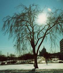
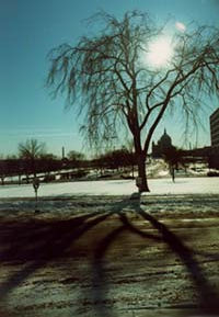
Interestingly, Ho Yu explains that the same is not true for horizontal symmetry. The example used in the article is the original tree, only this time the shot includes the sidewalk in front of the tree where it casts its shadow. The photo is divided into two sections (top and bottom) but now the shot is more appealing because the two sides are not symmetrical.
The last point made is that people universally view an item from top to bottom, not left to right (left to right perception varies by culture). A horizontally centered dam, road, or bridge can work as long as one’s focus isn’t drawn to something above it. Additionally, he warns a person not to place their main subject in the bottom of their photo unless they purposely steer a viewer’s eye away from the top by raising the horizontal line up.
