Saturday, November 8, 2008

Week 10 - Cloning and Text Tools

I've used the cloning tool many times before, but I never knew about the various options available on the cloning window before; I even showed them to my wife and chances are they'll make her work life a lot easier. I chose 4 images to play with for this assignment.

&
In this first one, I chose to create a double rainbow by positioning my cloning tool at the base of the existing rainbow, turning my overlay option on, reducing the second one's size slightly, and increasing the angle slightly as well. You may notice that I duplicated one tree, deleted another, took out the power line and pole, and lightened the entire sky to the left of my second rainbow.

&
This one isn't as clean as it could be, but I thought it would be nice to fill in this picture with more palm trees. I created three different cloning sources, each one a different tree. Then I made each one slightly smaller than their originals and using the overlay again I four news trees to the image. Next I used the magic lasso tool to delete any sky that was cloned next to the trunks, which created a strange glow. I would have done more to the light (or dark) spots between the leaves, but...

&
I thought it would be fun to remove the cat-strap from this picture. This one was all about turning off the aligned option. I wanted to preserve the ear piece's reflection as well as the chair's, so I had to be careful both not to clone over them or clone them elsewhere in the image.

&
I thought this photo was a good example of removing items that blocked one's subject. In this one, I cloned my wife's hair to get rid of the fern, cloned some of her sweat jacket to cover a leaf, and cloned her hand to cover some twigs.

& &

Even though I played with some of the text styles, I prefered to use the clone tool for my text styles instead. In all three of these photos I created my text, opened a new layer, then used the Load Selection option under Select select the shape of my text. Next, with All Layers selected, I cloned either the leaves or petals of my photos and, still on my new layer, applied them to my selected area. I really like how this comes out. In the case of my final picture, I rotated the text and applied some warping settings so that it appeared to become smaller as it rose up the trunk.

Sunday, November 2, 2008

Week 9 - Burn, Dodge, and Filter

Sorry this is kind of late in the week. I was toying around with the burn and dodge tools this week and discovered I overuse them. Every time I tried to adjust a photo, the result would come out much worse than its original. Frustration would take over and I'd move on to a different picture. Finally I showed my wife some of my trials and she suggested I use it to accent existing shadows and highlights rather than use it to control brightness and darkness, which was my problem. I played around with this concept and adjusted this flower photo. The adjusted one on the left gives the appearance of sun coming through the tree branches whereas the original appears dark and drab.

Next I chose a handful of pictures and tried out a variety of filters. The first one here is my little friend, the red eft, still hiding under his mushroom. After a few trials, came across the graphic pen tool on page 320 of our book and thought it would make the picture look like a block from a comic, but this didn't really happen. However, I really like how it makes the picture look as though it had been sketched. I can't recall the settings I chose on this one, but I think I decreased the size of the stokes and darkened the brightness some.

This second picture was taken about a week ago; it was taken looking up through a spiral of birch bark on the truck of a birch tree. There were a number of pictures I thought would look good with the glowing edges filter, but somehow this one stuck out the most for me. In fact, I stared at it for so long I began to see the name Obama in it. Can anyone else see that? On this one I changed the edge width to 6 and softness to 2.

Last, I really wanted to include my kitty and began searching for a filter that preserved her beauty and made her look as though she were painted. Again, using the book I found the angled strokes filter on page 319. I really like how this filter softened her fur (I never thought Sasha's fur could ever look softer than it already does). I made the direction balance about even, then increased my stroke length and sharpness.

Sunday, October 26, 2008

Week 8 - Adjustments

So I have to admit I took this assignment a bit too far and got in a little over my head. When looking through images to adjust, I found one that had shadows and aimed to replace them imperfectly. My first attempt was enough to feel I could ask my wife for a handful of pointers and try again. My second and third were not much better, but I felt I was on to something. Now after try four (by which I mean starting from scratch each time) I'm willing to admit I was attempting something that neither matched our week's requirement nor my skill level. I only present these to show I was doing something this week.

then

I guess I aimed too high because I felt I had enough experience with level adjustments to look for a bigger challenge. For example, I've scanned hundreds of images using both a slide and normal scanner and often these require level adjustments. But in the end I decided to make my task easier and chose the following three images to adjust - original first:

then
Brightness +65, Contrast -50, Saturation +20, Lightness +8

then
Brightness -50, Contrast +88, Saturation +18, magic tool wand sky and brightness -35, contrast -50

then
Saturation +46, then I adjusted Brightness and Contrast but I don't have specifics

Tuesday, October 21, 2008

Week 8 - Photomosaic

Let me first point out that I'm a big fan of Photomosaics. Besides having seen posters (like the American dollar bill made out of currency from around the world), I first fell in love with the art when I found a Photomosaic puzzle of the Earth at a yard sale. After completing it (this took months and many backaches to finish it) my wife and I purchased and completed the Starry Starry Night puzzle. We next purchased the La Grande Jatte Photomosaic puzzle, but have not started it yet. Although this may seem like an odd way to become familiar with the art, when completing a puzzle one must analyze every piece; however, when it comes to a Photomosaic puzzle, one must analyze every picture (often up to six) that appears on every piece. This hobby really made me appreciate all the images that make up the final Photomosaic picture.

Lastly, I was excited to realize that Apple's new operating system, Leopard, has a Photomosaic option for one's screen saver. After selecting a picture folder, the screen saver will first display a single image then zoom out to expose adjacent images until they all join together to form a single, different picture - that's the best I can describe it.

All that said, here is a self Photomosaic portrait made from my newly scanned Appalachian Trail photo collection. My first attempt (although much truer to the original photo's colors) appeared bland, rotated images 90 degrees, and seemed to allow too many duplicates. So, for this second one, I set the tiles to 2000, limited duplicates to 50 times, unchecked the rotate option, and... I think that's about it. In contrast to my first attempt, this image appears to have used more green in my "blue" t-shirt because I set these limitations.

Thursday, October 16, 2008

Week 7 - Compositing

So I was going through a collection of the pictures I've shared with this class and came up with three designs I'd like to share.

In this first one, I simply used the magnetic lasso tool in order to select the red eft from one picture so I could drag it over to a second picture. I then used the Rectangular Marquee tool in order to erase part of the eft's torso so it appeared to be coming from behind the left hand wall. I tried to work its tail in, but in the end I just hid the layer. Lastly, I used the clone stamp tool to round out its face.

In this second picture I wanted to play around with filling in the center of a sunflower. First I used the Elliptical Marquee tool to clear of the flower's center. Next, I once again used the magnetic lasso to trace the flower's outline. Then I dragged the petal outline over to the arrow hole of Doune Castle in Scotland. However, this one move left the castle wall filling in the borders of the picture, so I used the clone stamp tool to expand the the countryside and white sky to the photo's outer corners. It still looked pretty bland, so next I copied the sunset from my Oregon beach picture and the clouds from over Franconia Ridge in NH. It's not the greatest, but two countries and three states are represented.

This final idea came at the last minute and I was too impressed with the result not to include it in this week's post. I came across this picture I have of a statue near Buckingham Palace in London. In the original, the form is so dark that it's essentially a silhouette, so I used the magic wand tool to select the negative (black) space and deleted it's contents. Next I moved in the image of the hazy trees and placed it behind the first layer. Very simple creation, but I feel it's very effective.

Two things I'd like to point out: for each of these I created a new background layer and in a few instances I drew a selection area and then used Select/Inverse in order to protect my selected area from changes.

Sunday, October 12, 2008

Week 6 - Landscapes

I haven't been making too many trips lately, but not only do I have a lot of landscape shots I've also taken many over this past summer. In fact, I might I think I'll just embed another slideshow:


I'll add descriptions to each photo to calm everyone's curiosity.

The landscape site was a little too romantic and poetic for me, but I appreciated their passion for the perfect photo. Landscapes to me are an expanse of natural land (I just realized the site defines a landscape as "an expanse of natural scenery" but this would have been my answer anyway so I'll keep it). They can include man made objects, but distance should be displayed through various levels of scenery.

I think that often the largest contributor to getting the perfect landscape photo is perspective, which means that one must be in the perfect spot to get the shot. One must also be able to recognize depth; for instance, one might photograph a collection of trees, but they should also be aware of what's behind the trees and set their angle to take advantage of the scene's multiple levels.

One thing I enjoyed from the site was a reference to the passage of time in one's landscape photo.

Sunday, October 5, 2008

Week 5 - Composition and Aesthetics Research

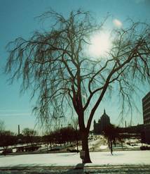
For this week’s research assignment on composition and aesthetics, I used our Hartness Library’s Academic OneFile article search engine and found a piece written by Chong Ho Yu from the August 2003 PSA Journal titled On Symmetrical Composition (Aesthetics of Photography).


In this article, Ho Yu discusses how the rules of vertical and horizontal composition differ from one another. He explains how, when a large subject (such as a tree) is centered vertically, it divides a photo into two equal parts thereby making the photo less interesting. However, either moving the subject into one of the two rule of thirds’ quadrants or including another subject that only appears on the left or right side can alter the photo’s symmetry making the it more pleasing.

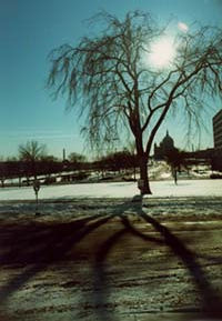
Interestingly, Ho Yu explains that the same is not true for horizontal symmetry. The example used in the article is the original tree, only this time the shot includes the sidewalk in front of the tree where it casts its shadow. The photo is divided into two sections (top and bottom) but now the shot is more appealing because the two sides are not symmetrical.

The last point made is that people universally view an item from top to bottom, not left to right (left to right perception varies by culture). A horizontally centered dam, road, or bridge can work as long as one’s focus isn’t drawn to something above it. Additionally, he warns a person not to place their main subject in the bottom of their photo unless they purposely steer a viewer’s eye away from the top by raising the horizontal line up.