For this week’s research assignment on composition and aesthetics, I used our Hartness Library’s Academic OneFile article search engine and found a piece written by Chong Ho Yu from the August 2003 PSA Journal titled On Symmetrical Composition (Aesthetics of Photography).
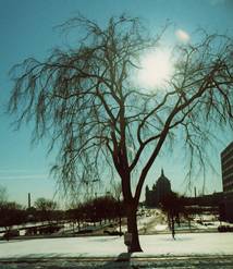
In this article, Ho Yu discusses how the rules of vertical and horizontal composition differ from one another. He explains how, when a large subject (such as a tree) is centered vertically, it divides a photo into two equal parts thereby making the photo less interesting. However, either moving the subject into one of the two rule of thirds’ quadrants or including another subject that only appears on the left or right side can alter the photo’s symmetry making the it more pleasing.
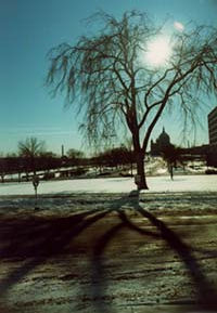
Interestingly, Ho Yu explains that the same is not true for horizontal symmetry. The example used in the article is the original tree, only this time the shot includes the sidewalk in front of the tree where it casts its shadow. The photo is divided into two sections (top and bottom) but now the shot is more appealing because the two sides are not symmetrical.
The last point made is that people universally view an item from top to bottom, not left to right (left to right perception varies by culture). A horizontally centered dam, road, or bridge can work as long as one’s focus isn’t drawn to something above it. Additionally, he warns a person not to place their main subject in the bottom of their photo unless they purposely steer a viewer’s eye away from the top by raising the horizontal line up.

2 comments:
Jay,
A very interesting and enlightening article about composition and aesthetics. Thanks!
I love the expanse of tree shadow in the bottom half of the photo! Proved your point quite well!
Post a Comment